Page 1 of 1
Repainting?
Posted: Sat Jun 26, 2010 2:28 am
by Zahru II
I wonder if this thread is okay here... oh well.
I just want to brag about my latest figure repaint, Thundercracker:
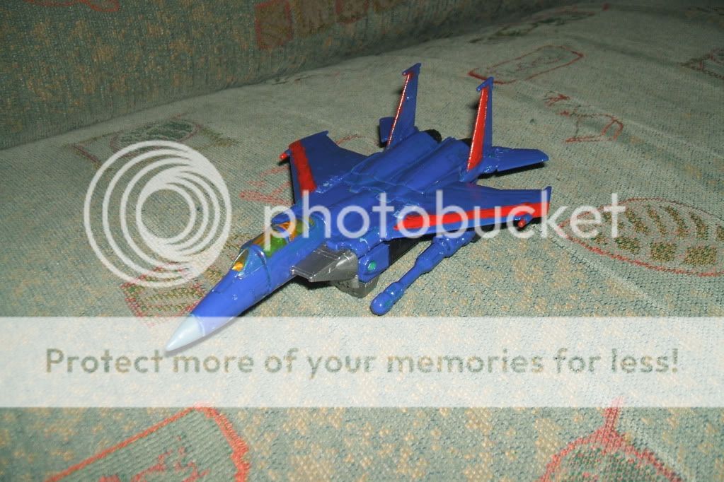
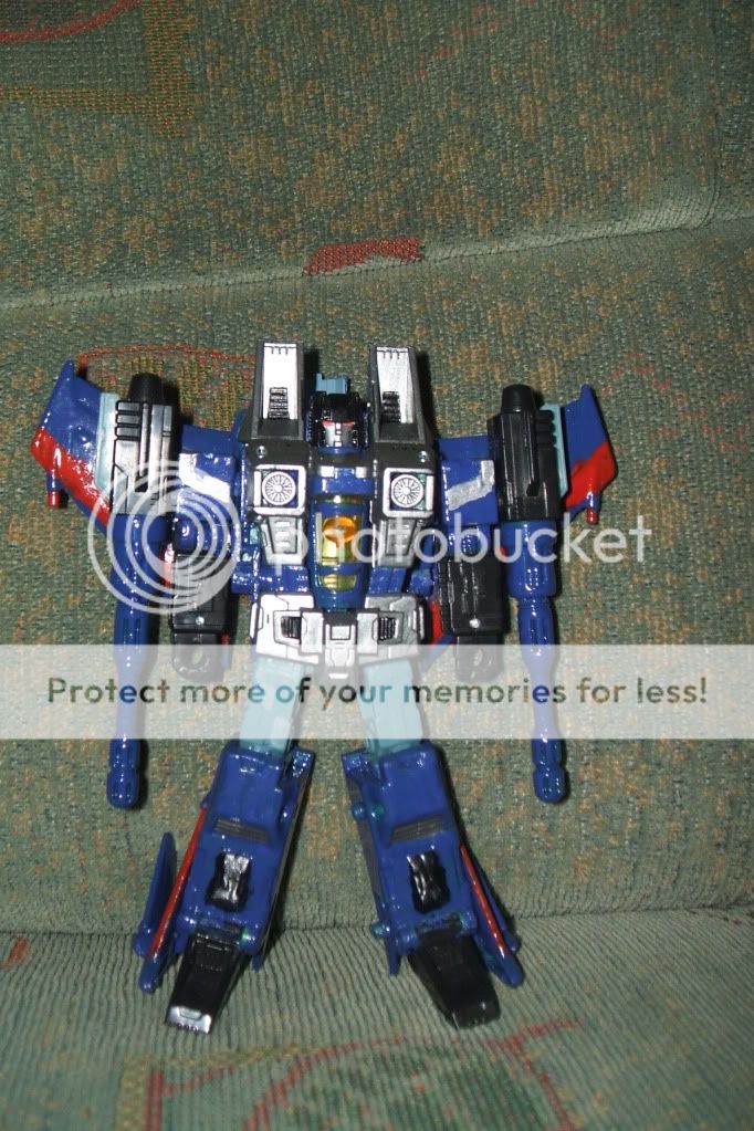
Moar pics here:
http://s409.photobucket.com/albums/pp17 ... omcracker/
Posted: Sat Jun 26, 2010 5:45 am
by Killer Karetsu
Nice painting.
Btw shouldn't warhammer paintings belong to the artwork section? In my opinion, warhammer 'reports should go to the lesser games and wurhumr paintings to artwork.
Posted: Sat Jun 26, 2010 12:12 pm
by aoffan23
.....This isn't Warhammer. This is a Transformer. Lol.
I'm not so big on the paint job, for two reasons:
6. I don't like the combination of blue and red, those colours for some reason seem crowded when used... I don't know how to explain it, it just feels cramped.
7. The paint is kind of thick, you might want to try to keep it thinner on your next pant job.
Posted: Sat Jun 26, 2010 1:33 pm
by Killer Karetsu
aoffan23 wrote:.....This isn't Warhammer. This is a Transformer. Lol.
I'm not so big on the paint job, for two reasons:
6. I don't like the combination of blue and red, those colours for some reason seem crowded when used... I don't know how to explain it, it just feels cramped.
7. The paint is kind of thick, you might want to try to keep it thinner on your next pant job.
I know y'know
it was just by the way because I thought not to make a thread about it.
Posted: Sat Jun 26, 2010 6:12 pm
by james+burgundy
Is it dry? does not look that way.
Posted: Sat Jun 26, 2010 11:51 pm
by Lt. Krus
Cracker? I thought Transformerz were robots, not caucasions

Posted: Sun Jun 27, 2010 1:55 pm
by Bonn-o-Tron
Dude, I love Thundercracker! (points to his avatar)
Posted: Mon Jun 28, 2010 12:46 am
by Zahru II
james+burgundy wrote:Is it dry? does not look that way.
It is. The paint is just horrificly glossy, and my flash makes it look worse.
Posted: Wed Jun 30, 2010 6:58 pm
by 'Mano
aoffan23 wrote:
6. I don't like the combination of blue and red, those colours for some reason seem crowded when used... I don't know how to explain it, it just feels cramped.
It may be because of their positions on the color wheel: theyre not complimentory or analogous.
In my opinion, blue and orange would have done wonders for this. =)
Posted: Thu Jul 01, 2010 1:48 am
by Zahru II
It's all Hasbro's fault!
I went mostly for accuracy.
Posted: Thu Jul 01, 2010 8:17 pm
by 'Mano
Zahru II wrote:It's all Hasbro's fault!
I went mostly for accuracy.
Good call, blame it on the toy company... ;D
If you were going for accuracy, you did a pretty good job!