Well it seems it was just steams gift sending system that was playing up - Scratch now owns The Ship and The Ship singleplayer, it seemed like a fitting second place prize.
Vami, gimme a little while and I'll send you something awesome.
BrikFiction Festival 2015
Moderators: The Shadowscythe, Quantumsurfer
-
The Shadowscythe

- Touch my cloud song and I will fuck you up

- Posts: 2351
- Joined: Sun Jul 27, 2008 7:22 am
- Location: Llandysul, Ceredigion, Wales, U.K, Earth, Sol, Milky Way, Local Cluster, Universe.
Re: BrikFiction Festival 2015
-- WARNINK -- LINK BELOW IZ KNOWN TO CAUZE HEMMORAGE --

I WARNED YOU, DIDN'T I WARN YOU?! BLAME RAYHAWK DAMNIT.
Spoiler
Show
I WARNED YOU, DIDN'T I WARN YOU?! BLAME RAYHAWK DAMNIT.


-
Quantumsurfer

- Contest Manager
- Posts: 2601
- Joined: Mon Apr 25, 2011 5:27 pm
Re: BrikFiction Festival 2015
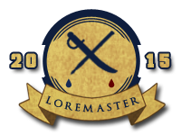
Ok, guys, I'm sorry. I tried to make a badge. The shitty ones I made for the Hellhunt seem to be the peak of my abilities. Apparently, I can't into art. I tried a bunch of different themes but everything I churned out was utter shit. Tried to do book graphics, open and closed. Tried for the old standby, the quill. Tried a quill and sword crossed. Even tried silly shit like a quill marking the Xs for eyes on a dead minifig head. Unless one of the forum's artists wants to be a saint and take over (I actually would like to award nice looking badges), it'll be awhile longer.
-
Quantumsurfer
- Contest Manager
- Posts: 2601
- Joined: Mon Apr 25, 2011 5:27 pm
Re: BrikFiction Festival 2015
Alright, I made one. It looks decent, I think, but I really struggled with the colors and the pen shape/positioning. Hope you like it. It's been added to the badges gallery and I'll be affixing it to Vami's post. He is, as I said, free to do with it what he likes.
-
Tzan

- Has anyone ever used those holes before?

- Posts: 4802
- Joined: Sun Dec 30, 2007 4:41 pm
- Location: Boston
Re: BrikFiction Festival 2015
The shapes are fine, but the colors are bad.
You've got a dark blue on dark brown. Mostly the Loremaster area.
It might as well be black on black, sure totally metal but not readable.
You need some contrast there, light color vs dark color.
You've got a dark blue on dark brown. Mostly the Loremaster area.
It might as well be black on black, sure totally metal but not readable.
You need some contrast there, light color vs dark color.

Re: BrikFiction Festival 2015
yesssssQuantumsurfer wrote:Alright, I made one. It looks decent, I think, but I really struggled with the colors and the pen shape/positioning. Hope you like it. It's been added to the badges gallery and I'll be affixing it to Vami's post. He is, as I said, free to do with it what he likes.

-
Quantumsurfer
- Contest Manager
- Posts: 2601
- Joined: Mon Apr 25, 2011 5:27 pm
Re: BrikFiction Festival 2015
You're absolutely right, of course. I thought it looked too hard to see, a dark blob. Both colors are nice colors but they don't play well with one another. I tried lightening the thing (this is the version with the brightness and contrast cranked up) but it fell short. I also tried using a lighter, more sky blue, and even a pastel green at one point. Nothing seems to work well with dark brown on this badge. This was the last of a few badges I tried last night, so I was probably just wrapped up in minutiae (I don't know how to better describe that part of the creative process). I might come back to it later and give it another go with fresh eyes.Tzan wrote:The shapes are fine, but the colors are bad.

Re: BrikFiction Festival 2015
I'm not a graphic designer, but I did learn some simple tricks in design school:
The trick to legible shapes in a graphic design is making sure that everything in the shape (including shading / beveling / etc) is either all lighter or all darker than everything in the background (including shadows / texture / etc) it's set against. Right now it's a lot of shapes with both light and dark elements against backgrounds with both light and dark elements, and that's why it's visually confusing.
The trick to legible shapes in a graphic design is making sure that everything in the shape (including shading / beveling / etc) is either all lighter or all darker than everything in the background (including shadows / texture / etc) it's set against. Right now it's a lot of shapes with both light and dark elements against backgrounds with both light and dark elements, and that's why it's visually confusing.
Natalya wrote:Wtf is going on in this thread?
-
Quantumsurfer
- Contest Manager
- Posts: 2601
- Joined: Mon Apr 25, 2011 5:27 pm
-
Quantumsurfer
- Contest Manager
- Posts: 2601
- Joined: Mon Apr 25, 2011 5:27 pm
Re: BrikFiction Festival 2015
I uploaded a new version. All the previous image tags reference the new file, so I spose I don't need to post it again.
I swapped the colors and added a parchment texture overlay to the tan bits. I had to remake the inner circles and the banner, so they might seem a little different. The words still seem incongruous to me. Maybe its that the 2015 is in parchment but the LoreMaster is in Blue. Possibly that in combination with the fact that the banner is light and dark brown and has no dark blue framing. Anyway, it's a marked improvement over the original so I think I'm going to leave it for now. Please let me know if you have any further suggestions for changing it in the future and for future badges. And thanks again for the help.
I swapped the colors and added a parchment texture overlay to the tan bits. I had to remake the inner circles and the banner, so they might seem a little different. The words still seem incongruous to me. Maybe its that the 2015 is in parchment but the LoreMaster is in Blue. Possibly that in combination with the fact that the banner is light and dark brown and has no dark blue framing. Anyway, it's a marked improvement over the original so I think I'm going to leave it for now. Please let me know if you have any further suggestions for changing it in the future and for future badges. And thanks again for the help.
Re: BrikFiction Festival 2015
Right now I'm just seeing that the dark part of the bevel is connecting with the dark of the blue shapes, while the light part of the bevel is connecting with the light of the parchment shape, so it's still breaking up the shape outline into a kind of camo pattern.Quantumsurfer wrote:The words still seem incongruous to me. Maybe its that the 2015 is in parchment but the LoreMaster is in Blue.
For a clear graphic read, everything that is part of the light shape needs to be unambiguously lighter than everything that is part of the dark shape, and vice versa. If you want to make those shapes read clearly, here's what to do:
If the bevel is going to be part of the parchment, then the shadows need to be light enough to be part of the parchment shape rather than part of the letter shapes.
If the bevel is going to be part of the dark letters, then the highlights need to be dark enough to be part of the letter shapes rather than the parchment shape.
Or, you can just remove the bevel completely and you'll get a clear read right away.
Natalya wrote:Wtf is going on in this thread?
Re: BrikFiction Festival 2015
collsipp wrote:It seems like the one on the forums was deleted in the Overlution. The one on the wiki is fine, though.
Fuck you Ham and fuck you Stubby for liposuctioning about 3000 bytes of information from that pageHam wrote:The list was compiled by Vami; he only put the buttplugs from the Brikwars he knew and loved.
-
Tzan
- Has anyone ever used those holes before?
- Posts: 4802
- Joined: Sun Dec 30, 2007 4:41 pm
- Location: Boston
Re: BrikFiction Festival 2015
Thanks, I was thinking about writing all that this morning but then I had things to do.stubby wrote: graphics stuff
I will add one thing.
Fancy Typefaces look fancy and work great at large sizes.
When you set them up too small it becomes mush.
Then when you bevel the mush, its super mush.
Just not enough pixels.
You can't see the gaps around the mid line of the E
You can't see the hole in the R or A
hard to see the interior non-S part of the S
Its probably the bevels fault, but it may be that the typeface is too fancy for that size.
I've done the same thing of course, make fancy thing too small.
( did ya see how I used the word typeface?
-
Quantumsurfer
- Contest Manager
- Posts: 2601
- Joined: Mon Apr 25, 2011 5:27 pm
Re: BrikFiction Festival 2015
Good stuff, thanks. All of this seems so obvious in retrospect. Good to know my gut feelings were at least on the right track. We'll get there.
-
Quantumsurfer
- Contest Manager
- Posts: 2601
- Joined: Mon Apr 25, 2011 5:27 pm
Re: BrikFiction Festival 2015
Okay, newest version. Ditched the bevel. The flat graphic doesn't have that stamped in look but reads clearer and, I think, ultimately looks nicer. Did the same with the title. Also took the advice to scrap the blocky brikwars-esque typeface and go with something simpler, cleaner, and easier to read. It definitely looks better but felt way too thin at first against the bold lines everywhere else, so I tried to bulk it up with a center stroke. It's readable and it looks better, so that's another step forward.
Any suggestions for altering the font or does this seem solid?
Also, just out of curiosity, is there actually a blocky font that BW uses or are those letters graphically modified/constructed? A few months back, I just eyeballed free fonts until I found one that looked most similar and that's what I've been using.