The wide crazy world of art and also stuff
Moderators: Arkbrik, Hoboman
-
mr.duckie
- Officer
- Posts: 155
- Joined: Sun Jul 18, 2010 8:12 pm
- Location: michigan
Post
by mr.duckie » Thu Jul 26, 2012 10:14 pm
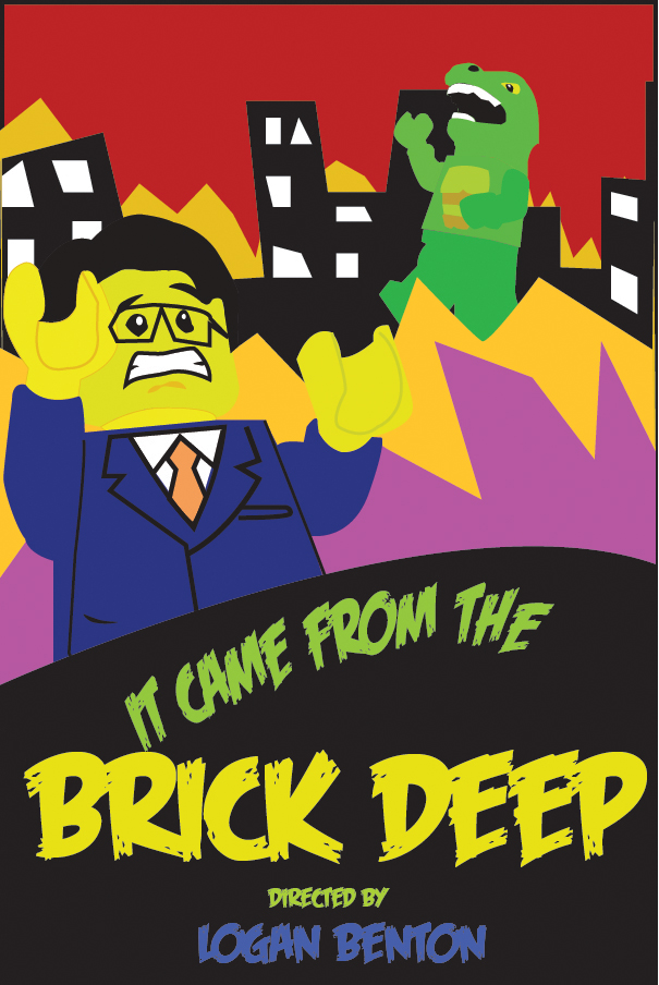
I made a movie poster To put outside the theater I'm building, I think it turned out pretty well.
All done in illustrator.
Last edited by
mr.duckie on Thu Jul 26, 2012 11:13 pm, edited 1 time in total.
-
Thesson
- Cannon Fodder
- Posts: 319
- Joined: Thu May 17, 2012 9:14 pm
- Location: Mars
Post
by Thesson » Thu Jul 26, 2012 10:17 pm
For a civilian scenery I applaud you
-
Blitzen
- Distinguished Owner of the English Language

- Posts: 1727
- Joined: Tue Jan 01, 2008 5:17 pm
- Location: Toronto, Ontario, Canada
-
Contact:
Post
by Blitzen » Thu Jul 26, 2012 10:53 pm
It's broken.
Often, literally, a pillow fight but may include similar situations like volleyball, particularly when wardrobe is skimpy and the action is bouncy.
-
BFenix
- Pooplord
- Posts: 4112
- Joined: Wed Jan 06, 2010 2:13 pm
- Location: City Of Ravens (Lisbon)
-
Contact:
Post
by BFenix » Thu Jul 26, 2012 11:00 pm
Blitzen wrote:It's broken.
-
mr.duckie
- Officer
- Posts: 155
- Joined: Sun Jul 18, 2010 8:12 pm
- Location: michigan
Post
by mr.duckie » Thu Jul 26, 2012 11:14 pm
Fixed, I Knew using google drive was too good to be true.
-
Thesson
- Cannon Fodder
- Posts: 319
- Joined: Thu May 17, 2012 9:14 pm
- Location: Mars
Post
by Thesson » Thu Jul 26, 2012 11:30 pm
MWAHAHA! I was able to see it using the power of:
CHROME!!!!
-
Blitzen
- Distinguished Owner of the English Language
- Posts: 1727
- Joined: Tue Jan 01, 2008 5:17 pm
- Location: Toronto, Ontario, Canada
-
Contact:
Post
by Blitzen » Fri Jul 27, 2012 12:00 am
Thesson wrote:MWAHAHA! I was able to see it using the power of:
CHROME!!!!
I also use Chrome, but the image wasn't working. It is now though.
mr. duckie:
I like it. The layout is nice, and it manages to convey a lot despite the simplification of images. One thing: the glasses should behind the right hand, not in front. It looks a bit wonky the way you have it.
You might want to look into a variety of typefaces instead of just the one; it' a bit illegible at small size. I'd suggest keeping the title the way it is, but changing the rest to a simpler sans-serif.
Good job!
Often, literally, a pillow fight but may include similar situations like volleyball, particularly when wardrobe is skimpy and the action is bouncy.
-
mr.duckie
- Officer
- Posts: 155
- Joined: Sun Jul 18, 2010 8:12 pm
- Location: michigan
Post
by mr.duckie » Fri Jul 27, 2012 12:05 am
Blitzen wrote:Thesson wrote:MWAHAHA! I was able to see it using the power of:
CHROME!!!!
I also use Chrome, but the image wasn't working. It is now though.
mr. duckie:
I like it. The layout is nice, and it manages to convey a lot despite the simplification of images. One thing: the glasses should behind the right hand, not in front. It looks a bit wonky the way you have it.
You might want to look into a variety of typefaces instead of just the one; it' a bit illegible at small size. I'd suggest keeping the title the way it is, but changing the rest to a simpler sans-serif.
Good job!
I noticed the glasses thing, there was a mix up with things being on the wrong layers, so I decided that it wouldn't really matter because The final print is two inches high.
I also had "Only use one font." drilled into my head in graphic design class.
Thanks for the feedback!
-
Thesson
- Cannon Fodder
- Posts: 319
- Joined: Thu May 17, 2012 9:14 pm
- Location: Mars
Post
by Thesson » Fri Jul 27, 2012 12:07 am
Oh. I don't know what happened to you guys then.